Slides · PPTX · 221 KB · 28 slides
Statistical diagrams 1 - Teacher Slides.pptx
The lesson slides with the teacher's notes on each slide, and every question and mark scheme built in. Built from the lesson script on 29 September 2026.
EDEXCEL GCSE MATHS · FOUNDATION & HIGHER

Statistical diagrams 1
Interpreting and representing data
Lesson 1 of 6
openrevise.com
EDEXCEL GCSE MATHS · FOUNDATION & HIGHER

Before We Start
Interpreting and representing data
Lesson 1 of 6
Answer each one, then check.
1
How many degrees are there in a full turn?
2
What is 25% of 360?
3
Write ¼ as a percentage.
4
What is the mode of 3, 5, 5, 7?
5
Work out 360 ÷ 60.
openrevise.com
EDEXCEL GCSE MATHS · FOUNDATION & HIGHER

Before We Start - Answers
Interpreting and representing data
Lesson 1 of 6
1
How many degrees are there in a full turn?
360°
2
What is 25% of 360?
90
3
Write ¼ as a percentage.
25%
4
What is the mode of 3, 5, 5, 7?
5 - the most common value.
5
Work out 360 ÷ 60.
6
openrevise.com
EDEXCEL GCSE MATHS · FOUNDATION & HIGHER

Learning Objectives
Interpreting and representing data
Lesson 1 of 6
1
Tell the difference between types of data.
2
Use frequency tables and two-way tables.
3
Draw and read bar charts, including dual and composite bar charts.
4
Work out the angles for a pie chart and draw it.
5
Read information from a pie chart.
openrevise.com
EDEXCEL GCSE MATHS · FOUNDATION & HIGHER

Types of Data
Interpreting and representing data
Lesson 1 of 6
Qualitative (categorical)
Described in words: favourite colour, type of pet.
Quantitative
Numbers: height, number of siblings.
Discrete
Can only take certain values, usually counted: number of goals, shoe size.
Continuous
Can take any value in a range, usually measured: height, time, mass.
Primary data
Collected by you, for example with a questionnaire.
Secondary data
Collected by someone else, for example from a website.
openrevise.com
EDEXCEL GCSE MATHS · FOUNDATION & HIGHER

Frequency Tables
Interpreting and representing data
Lesson 1 of 6
A frequency table counts how often each value or category appears.
Tally
Make a mark for each item, grouping them in fives with a line through four: it is easy to count.
Frequency
The total count for each row.
Check the total
The frequencies should add up to the number of items in the data.
Grouped data
When there are many different values, group them into classes such as 10 < t ≤ 20 - "more than 10, up to and including 20".
openrevise.com
EDEXCEL GCSE MATHS · FOUNDATION & HIGHER

Two-Way Tables
Interpreting and representing data
Lesson 1 of 6
A two-way table shows two sets of information about the same group at once.
Rows and columns
One piece of information across the top, the other down the side.
Totals
The last row and column hold totals. Every row and every column adds up to its total.
Filling in gaps
Use the totals: if you know a total and all but one of its parts, subtract.
Reading
Read along a row and down a column to the cell where they meet.
openrevise.com
EDEXCEL GCSE MATHS · FOUNDATION & HIGHER

A Two-Way Table
Interpreting and representing data
Lesson 1 of 6
90 Year 10 students chose one school trip.
Theme park
Zoo
Museum
Total
Boys
23
8
14
45
Girls
17
15
13
45
Total
40
23
27
90
openrevise.com
EDEXCEL GCSE MATHS · FOUNDATION & HIGHER

Completing a Two-Way Table
Interpreting and representing data
Lesson 1 of 6
Using only these facts, find how many boys chose the museum: 90 students; 45 are boys; 40 chose the theme park, 23 of them boys; 15 girls chose the zoo; 23 students chose the zoo in total.
1
Boys who chose the zoo
23 − 15 = 8
2
Boys who chose the museum = boys − theme park − zoo
45 − 23 − 8
3
Work it out
14
ANSWER
14 boys chose the museum
openrevise.com
EDEXCEL GCSE MATHS · FOUNDATION & HIGHER

Dual or Composite Bar Chart?
Interpreting and representing data
Lesson 1 of 6
DUAL BAR CHART
• Two bars side by side for each category.
• One bar for each group, e.g. boys and girls.
• Best for comparing the groups within each category.
• Needs a key.
COMPOSITE BAR CHART
• One bar for each category, split into parts.
• Each part shows one group, stacked on top.
• Best for seeing the total and how it is made up.
• Needs a key.
openrevise.com
EDEXCEL GCSE MATHS · FOUNDATION & HIGHER

PART TWO
Pie Charts
Showing how a whole is shared out.
openrevise.com
EDEXCEL GCSE MATHS · FOUNDATION & HIGHER

Drawing a Pie Chart
Interpreting and representing data
Lesson 1 of 6
The whole circle, 360°, stands for the whole of the data.
Degrees per item
Divide 360 by the total frequency.
Each angle
Multiply each frequency by the degrees per item.
Check
The angles must add up to 360°.
Draw
Draw a radius, measure each angle with a protractor from the last line, and label every sector.
openrevise.com
EDEXCEL GCSE MATHS · FOUNDATION & HIGHER

Working Out the Angles
Interpreting and representing data
Lesson 1 of 6
60 students were asked their favourite sport. 360 ÷ 60 = 6, so each student is worth 6°.
Sport
Frequency
Angle
Football
21
21 × 6 = 126°
Tennis
9
9 × 6 = 54°
Swimming
18
18 × 6 = 108°
Other
12
12 × 6 = 72°
Total
60
360°
openrevise.com
EDEXCEL GCSE MATHS · FOUNDATION & HIGHER

The Pie Chart
Interpreting and representing data
Lesson 1 of 6
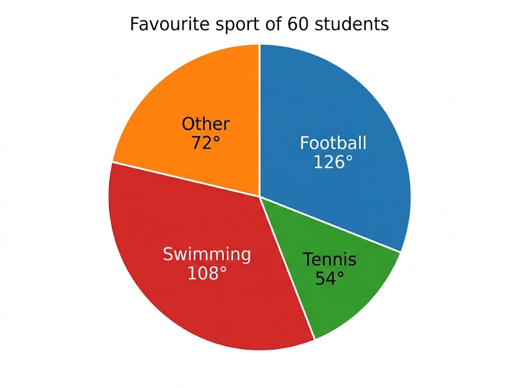
Each student is 6° of the circle.
The biggest sector shows the most popular answer at a glance - here, football. A pie chart shows proportions, not numbers: to find how many chose a sport, you need the total as well as the angle.
openrevise.com
EDEXCEL GCSE MATHS · FOUNDATION & HIGHER

Reading a Pie Chart
Interpreting and representing data
Lesson 1 of 6
A pie chart shows how 720 people travel to work. The sector for "cycle" has an angle of 75°. How many people cycle to work?
1
The sector is a fraction of the whole circle
75/360
2
Multiply by the total
75/360 × 720
3
Simplify: 720 ÷ 360 = 2
75 × 2
ANSWER
150 people
openrevise.com
EDEXCEL GCSE MATHS · FOUNDATION & HIGHER

Key Terms
Interpreting and representing data
Lesson 1 of 6
Frequency
How many times a value or category appears.
Discrete data
Data that can only take particular values, usually counted.
Continuous data
Data that can take any value in a range, usually measured.
Two-way table
A table showing two sets of information about the same group.
Composite bar chart
A bar chart with each bar split into parts for different groups.
Sector
A "slice" of a pie chart.
openrevise.com
EDEXCEL GCSE MATHS · FOUNDATION & HIGHER
Interpreting and representing data
Lesson 1 of 6

YOUR TASK
Class Survey
15 minutes
Ask everyone in the class one question with four or five possible answers (for example, "How did you get to school today?"). Record the answers in a two-way table split by boys and girls. Then draw a pie chart of all the answers and a dual bar chart comparing boys and girls.
1
Collect and tally the answers.
2
Fill in the two-way table and its totals.
3
Work out the angles, then draw the pie chart.
4
Draw the dual bar chart.
WHAT A GOOD ANSWER SHOWS
A completed two-way table with correct totals, a pie chart whose angles add to 360°, and a labelled dual bar chart with a key.
openrevise.com
EDEXCEL GCSE MATHS · FOUNDATION & HIGHER

Can I...?
Interpreting and representing data
Lesson 1 of 6
Say whether data is qualitative or quantitative.
Say whether data is discrete or continuous.
Complete a frequency table.
Complete and read a two-way table.
Draw and read dual and composite bar charts.
Work out the angles for a pie chart.
Draw a pie chart.
Read information from a pie chart.
openrevise.com
EDEXCEL GCSE MATHS · FOUNDATION & HIGHER
Summary & Exam Focus
Data is qualitative or quantitative; quantitative data is discrete or continuous.
Two-way tables: every row and column adds up to its total.
Pie chart angle = frequency × (360 ÷ total). The angles add to 360°.
Number in a sector = angle/360 × total.
EXAM FOCUS
A pie chart shows how 900 people travel to work. The angle for bus is 80°. How many people travel by bus? (2 marks)
For any pie chart question, first work out what 1° (or 1 person) is worth. Everything else follows from that one number.
openrevise.com
EDEXCEL GCSE MATHS · FOUNDATION & HIGHER

Exam Practice: Statistical Diagrams 1
Interpreting and representing data
Lesson 1 of 6
Answer all questions. Show your working. Questions 1 to 3 are non-calculator. · 20 minutes
Question 1 · 1 mark · Non-calculator
Is the number of people in a car discrete data or continuous data?
Question 2 · 3 marks · Non-calculator
80 students each study one language: French, Spanish or German. 42 of the students are girls. 17 boys study French. 21 students study…
Question 3 · 3 marks · Non-calculator
40 people were asked which pet they own. 14 own a dog, 11 own a cat, 5 own a fish and 10 own no pet. Work out the angle for each sector of…
Question 4 · 2 marks · Calculator
The pie chart shows how 900 people travel to work. The angle for bus is 80°. How many people travel to work by bus?
openrevise.com
EDEXCEL GCSE MATHS · FOUNDATION & HIGHER

Question 1 · 1 mark · Non-calculator
Interpreting and representing data
Lesson 1 of 6
“
Is the number of people in a car discrete data or continuous data?
HOW TO ANSWER IT
Command word: Non-calculator. Worth 1 mark, so plan before writing.
openrevise.com
EDEXCEL GCSE MATHS · FOUNDATION & HIGHER

Question 1 · mark scheme
Interpreting and representing data
Lesson 1 of 6
1 mark available. Award a mark for each point made.
Discrete
B1
openrevise.com
EDEXCEL GCSE MATHS · FOUNDATION & HIGHER

Question 2 · 3 marks · Non-calculator
Interpreting and representing data
Lesson 1 of 6
“
80 students each study one language: French, Spanish or German. 42 of the students are girls. 17 boys study French. 21 students study Spanish, and 12 of them are girls. How many boys study German?
HOW TO ANSWER IT
Command word: Non-calculator. Worth 3 marks, so plan before writing.
openrevise.com
EDEXCEL GCSE MATHS · FOUNDATION & HIGHER

Question 2 · mark scheme
Interpreting and representing data
Lesson 1 of 6
3 marks available. Award a mark for each point made.
38 boys, or a two-way table started with at least two correct values
P1
9 boys study Spanish
P1
12
A1
openrevise.com
EDEXCEL GCSE MATHS · FOUNDATION & HIGHER

Question 3 · 3 marks · Non-calculator
Interpreting and representing data
Lesson 1 of 6
“
40 people were asked which pet they own. 14 own a dog, 11 own a cat, 5 own a fish and 10 own no pet. Work out the angle for each sector of a pie chart.
HOW TO ANSWER IT
Command word: Non-calculator. Worth 3 marks, so plan before writing.
openrevise.com
EDEXCEL GCSE MATHS · FOUNDATION & HIGHER

Question 3 · mark scheme
Interpreting and representing data
Lesson 1 of 6
3 marks available. Award a mark for each point made.
360 ÷ 40 = 9, or one correct angle
M1
At least two correct angles
A1
All four correct: 126°, 99°, 45°, 90°
A1
openrevise.com
EDEXCEL GCSE MATHS · FOUNDATION & HIGHER

Question 4 · 2 marks · Calculator
Interpreting and representing data
Lesson 1 of 6
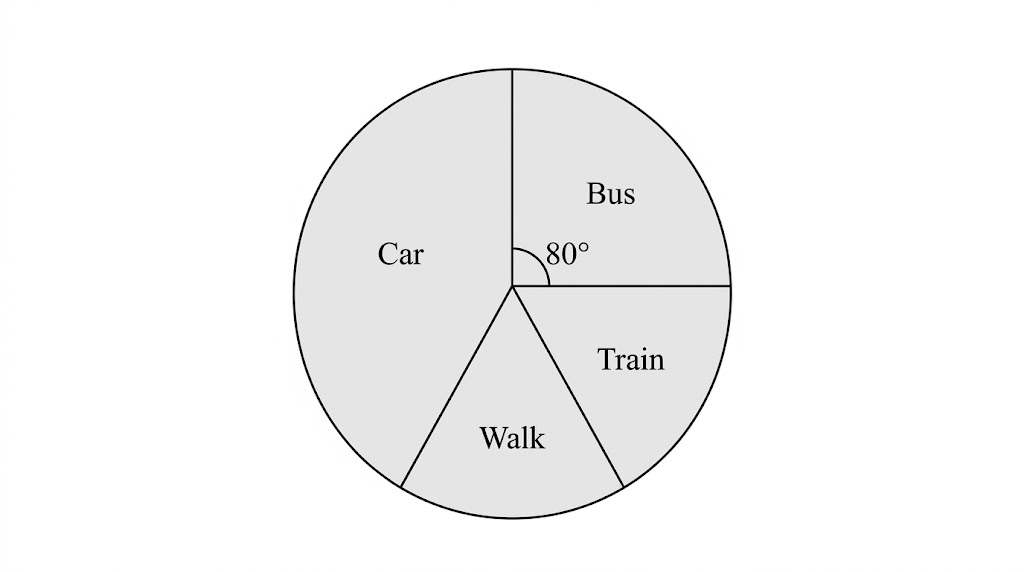
The pie chart shows how 900 people travel to work. The angle for bus is 80°. How many people travel to work by bus? (2 marks)
openrevise.com
EDEXCEL GCSE MATHS · FOUNDATION & HIGHER

Question 4 · mark scheme
Interpreting and representing data
Lesson 1 of 6
2 marks available. Award a mark for each point made.
80/360 × 900, or 900 ÷ 360 = 2.5
M1
200
A1
openrevise.com
← → to move, F to present full screen, G for every slide at once.