Slides · PPTX · 224 KB · 23 slides
Time series - Teacher Slides.pptx
The lesson slides with the teacher's notes on each slide, and every question and mark scheme built in. Built from the lesson script on 29 September 2026.
EDEXCEL GCSE MATHS · FOUNDATION & HIGHER

Time series
Interpreting and representing data
Lesson 2 of 6
openrevise.com
EDEXCEL GCSE MATHS · FOUNDATION & HIGHER

Last Lesson and Before
Interpreting and representing data
Lesson 2 of 6
Answer each one, then check.
1
Last lesson: a sector of 90° on a pie chart of 200 people - how many people?
2
Last lesson: is time discrete or continuous?
3
Work out the mean of 2, 4 and 6.
4
What are the coordinates of a point 3 across and 5 up?
openrevise.com
EDEXCEL GCSE MATHS · FOUNDATION & HIGHER

Last Lesson and Before - Answers
Interpreting and representing data
Lesson 2 of 6
1
Last lesson: a sector of 90° on a pie chart of 200 people - how many people?
50
2
Last lesson: is time discrete or continuous?
Continuous
3
Work out the mean of 2, 4 and 6.
4
4
What are the coordinates of a point 3 across and 5 up?
(3, 5)
openrevise.com
EDEXCEL GCSE MATHS · FOUNDATION & HIGHER

Learning Objectives
Interpreting and representing data
Lesson 2 of 6
1
Plot a time series graph.
2
Read values from a time series graph.
3
Describe the trend of a time series.
4
Recognise seasonal variation.
5
Make predictions, and say how reliable they are.
openrevise.com
EDEXCEL GCSE MATHS · FOUNDATION & HIGHER

What Is a Time Series?
Interpreting and representing data
Lesson 2 of 6
A time series is a set of data recorded at regular intervals of time.
The axes
Time always goes on the horizontal axis, in equal steps. The data goes on the vertical axis.
Plotting
Plot each value above its time.
Joining
Join the points with straight lines. The lines only show the pattern - they do not give real values between the points.
Examples
Monthly rainfall, quarterly sales, a city's population every ten years.
openrevise.com
EDEXCEL GCSE MATHS · FOUNDATION & HIGHER

Ice Cream Sales
Interpreting and representing data
Lesson 2 of 6
A seaside ice cream shop's sales, in thousands of pounds, each quarter (three months) for two years.
Year
Q1 (Jan to Mar)
Q2 (Apr to Jun)
Q3 (Jul to Sep)
Q4 (Oct to Dec)
Year 1
12
20
26
10
Year 2
14
23
29
12
openrevise.com
EDEXCEL GCSE MATHS · FOUNDATION & HIGHER

The Time Series Graph
Interpreting and representing data
Lesson 2 of 6
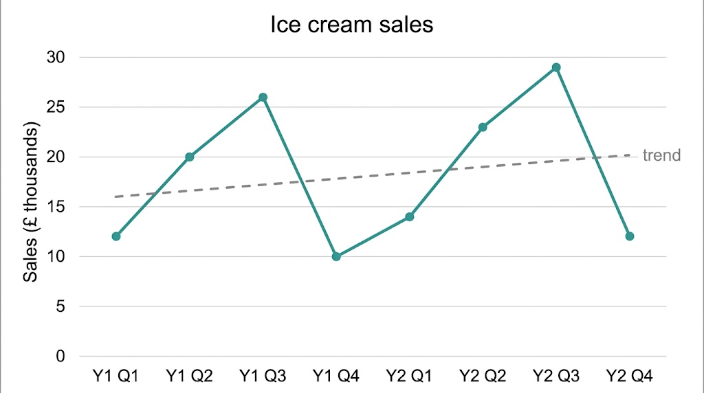
Up every summer, down every winter - and a little higher each year.
Two things show at once. Sales peak in Q3 (summer) and fall in Q4 every year - that is seasonal variation. And each quarter is a little higher than the same quarter a year earlier - that is the trend, which is increasing.
openrevise.com
EDEXCEL GCSE MATHS · FOUNDATION & HIGHER

Trend and Seasonal Variation
Interpreting and representing data
Lesson 2 of 6
Describe a time series in two parts.
The trend
The general direction over the whole time: increasing, decreasing or staying about the same. Ignore the ups and downs.
Seasonal variation
A pattern that repeats at the same time each year, like higher ice cream sales every summer.
Compare like with like
Compare Q3 with the Q3 before it, not with Q4: 29 against 26 shows the growth.
Use the context
Say what the numbers mean: "sales increased", not just "the line goes up".
openrevise.com
EDEXCEL GCSE MATHS · FOUNDATION & HIGHER

Reading a Time Series
Interpreting and representing data
Lesson 2 of 6
Using the ice cream sales, (a) how much higher were sales in Q3 of Year 2 than in Q3 of Year 1? (b) Describe the trend. (c) Describe the seasonal pattern.
1
(a) Read the two values
Year 1 Q3 = 26, Year 2 Q3 = 29
2
Subtract, and remember the units
29 − 26 = 3 thousand pounds
3
(b) Compare each quarter with the same quarter a year earlier
Every quarter is higher in Year 2
4
(c) Look for the repeating pattern
Highest in Q3, lowest in Q4, every year
ANSWER
(a) £3000 higher. (b) Sales are increasing. (c) Sales are highest in summer (Q3) and lowest in Q4.
openrevise.com
EDEXCEL GCSE MATHS · FOUNDATION & HIGHER

Making Predictions
Interpreting and representing data
Lesson 2 of 6
A time series can be used to predict what will happen next - with care.
Follow both patterns
Continue the trend AND the seasonal pattern: Year 3 Q3 might be about 32.
Near is better
A prediction for next quarter is more reliable than one for five years' time.
Things change
A new competitor, a wet summer or a price rise could break the pattern.
Say so
In an exam, a comment on reliability usually mentions how far ahead the prediction is.
openrevise.com
EDEXCEL GCSE MATHS · FOUNDATION & HIGHER

A Good Time Series Graph
Interpreting and representing data
Lesson 2 of 6
Equal time steps
Each quarter, month or year takes the same space on the axis.
Labelled axes
With units, such as "Sales (£ thousands)".
Accurate points
Each point plotted exactly above its time.
Straight lines
Points joined with a ruler, in order.
openrevise.com
EDEXCEL GCSE MATHS · FOUNDATION & HIGHER
Interpreting and representing data
Lesson 2 of 6
CASE STUDY

The Central England Temperature Record
The Central England Temperature series is the longest record of measured temperatures in the world. It gives the average temperature of a triangle of central England for every month since 1659, built from old diaries and weather records for the earliest years. Plotted as a time series, it shows a strong seasonal pattern - warm summers and cold winters, every year - and, over the last century, a clear upward trend in temperature.
1659
The year the monthly record begins
360+
Years of monthly temperatures in one time series
openrevise.com
EDEXCEL GCSE MATHS · FOUNDATION & HIGHER

Key Terms
Interpreting and representing data
Lesson 2 of 6
Time series
Data recorded at regular intervals of time.
Trend
The general direction of the data over time.
Seasonal variation
A pattern that repeats at the same time each year.
Quarter
A three-month period of the year.
Prediction
An estimate of a future value based on the pattern so far.
openrevise.com
EDEXCEL GCSE MATHS · FOUNDATION & HIGHER
Interpreting and representing data
Lesson 2 of 6

YOUR TASK
Make Your Own Time Series
15 minutes
A cinema's visitors, in thousands, each quarter for two years were: Year 1: 18, 15, 22, 30. Year 2: 20, 16, 25, 34. Draw a time series graph. Describe the trend and the seasonal variation, and predict Year 3 Q4 with a comment on how reliable your prediction is.
1
Draw and label the axes.
2
Plot and join the points.
3
Describe the trend and seasonal pattern.
4
Predict, and comment.
WHAT A GOOD ANSWER SHOWS
A graph with equal quarters on the horizontal axis and points joined with straight lines. Trend: increasing (every quarter higher in Year 2). Seasonal: busiest in Q4 (the Christmas holidays), quietest in Q2. Prediction around 37 to 38 thousand, reasonably reliable as it is only one year ahead - but new films or prices could change it.
openrevise.com
EDEXCEL GCSE MATHS · FOUNDATION & HIGHER

Can I...?
Interpreting and representing data
Lesson 2 of 6
Plot a time series graph.
Read values from a time series.
Describe the trend.
Describe seasonal variation.
Compare values a year apart.
Make a prediction.
Comment on how reliable a prediction is.
Answer in the context of the data.
openrevise.com
EDEXCEL GCSE MATHS · FOUNDATION & HIGHER
Summary & Exam Focus
Time goes on the horizontal axis in equal steps; points are joined with straight lines.
The trend is the overall direction; seasonal variation is the pattern that repeats each year.
Compare each quarter with the same quarter in the year before.
Predictions are less reliable the further ahead they go.
EXAM FOCUS
Describe the trend in the number of visitors to the museum. (1 mark)
Always answer in context: "the number of visitors increased" earns the mark; "it goes up" often does not.
openrevise.com
EDEXCEL GCSE MATHS · FOUNDATION & HIGHER

Exam Practice: Time Series
Interpreting and representing data
Lesson 2 of 6
Answer all questions. Show your working. · 15 minutes
Question 1 · 3 marks · Calculator
The time series graph shows the number of visitors, in thousands, to a museum each quarter for three years. (a) How many visitors were…
Question 2 · 2 marks · Calculator
In Year 3 the museum had 3800, 5200, 7600 and 3400 visitors in the four quarters. Work out the mean number of visitors per quarter in Year…
Question 3 · 1 mark · Calculator
The museum's manager uses the graph to predict the number of visitors in Year 8. Give one reason why this prediction may not be reliable.
openrevise.com
EDEXCEL GCSE MATHS · FOUNDATION & HIGHER

Question 1 · 3 marks · Calculator
Interpreting and representing data
Lesson 2 of 6
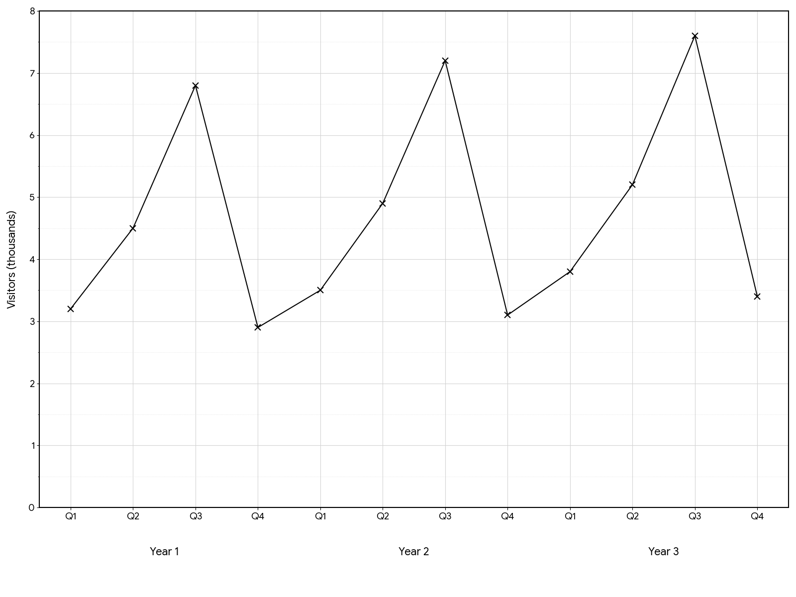
The time series graph shows the number of visitors, in thousands, to a museum each quarter for three years. (a) How many visitors were there in Q2 of Year 2? (b) Describe the trend in the number of visitors. (c) In which quarter is the museum busiest each year? Suggest a reason. (3 marks)
openrevise.com
EDEXCEL GCSE MATHS · FOUNDATION & HIGHER

Question 1 · mark scheme
Interpreting and representing data
Lesson 2 of 6
3 marks available. Award a mark for each point made.
(a) 4900, or 4.9 thousand
B1
(b) Increasing, in context
C1
(c) Q3, with a sensible reason such as summer holidays
C1
openrevise.com
EDEXCEL GCSE MATHS · FOUNDATION & HIGHER

Question 2 · 2 marks · Calculator
Interpreting and representing data
Lesson 2 of 6
“
In Year 3 the museum had 3800, 5200, 7600 and 3400 visitors in the four quarters. Work out the mean number of visitors per quarter in Year 3.
HOW TO ANSWER IT
Command word: Calculator. Worth 2 marks, so plan before writing.
openrevise.com
EDEXCEL GCSE MATHS · FOUNDATION & HIGHER

Question 2 · mark scheme
Interpreting and representing data
Lesson 2 of 6
2 marks available. Award a mark for each point made.
(3800 + 5200 + 7600 + 3400) ÷ 4, or 20 000 seen
M1
5000
A1
openrevise.com
EDEXCEL GCSE MATHS · FOUNDATION & HIGHER

Question 3 · 1 mark · Calculator
Interpreting and representing data
Lesson 2 of 6
“
The museum's manager uses the graph to predict the number of visitors in Year 8. Give one reason why this prediction may not be reliable.
HOW TO ANSWER IT
Command word: Calculator. Worth 1 mark, so plan before writing.
openrevise.com
EDEXCEL GCSE MATHS · FOUNDATION & HIGHER

Question 3 · mark scheme
Interpreting and representing data
Lesson 2 of 6
1 mark available. Award a mark for each point made.
A reason referring to predicting far beyond the data, or to the pattern changing
C1
openrevise.com
← → to move, F to present full screen, G for every slide at once.